Stefanie Endlich
Honorary Professor of the Faculty of Fine Arts, Berlin University of the Arts (Universität der Künste Berlin)
Cover picture: Imperial Eagle with Swastica at the “Führer’s Building” in Munich; picture taken in the Munich Documentation Centre for the History of National Socialism (picture: Stefanie Endlich
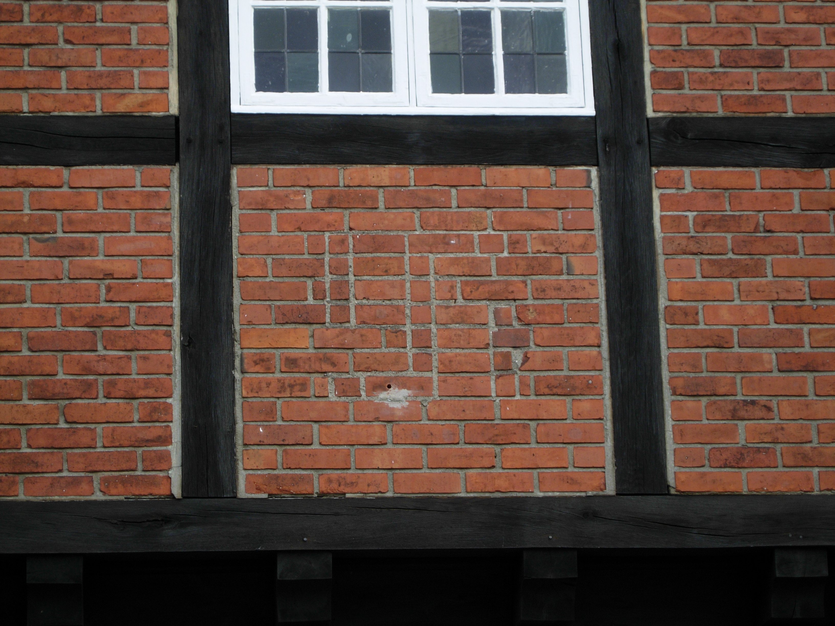
Right after the capitulation of Nazi Germany, the Allied Control Council decreed that all militaristic and Nazi symbols in the public space had to be removed. This order concerned especially the Swastica (which since 1933 had been presented, as part of the eagle emblem, at all public buildings and all over Germany), all Hitler portraits and those monuments which expressed the National Socialist ideology in a point-blank way. Some important buildings of the Nazi regime were torn down, like Hitler’s New Reich Chancellery in Berlin. But most of the eliminations were undertaken in a pragmatic way: by scratching off the Nazi symbols and leaving the rest unspoiled. In a certain way, this was the de-Nacification of the public space. Instead of the former Nazi symbol, an empty spot appeared. Sometimes you can still recognize some contours today.

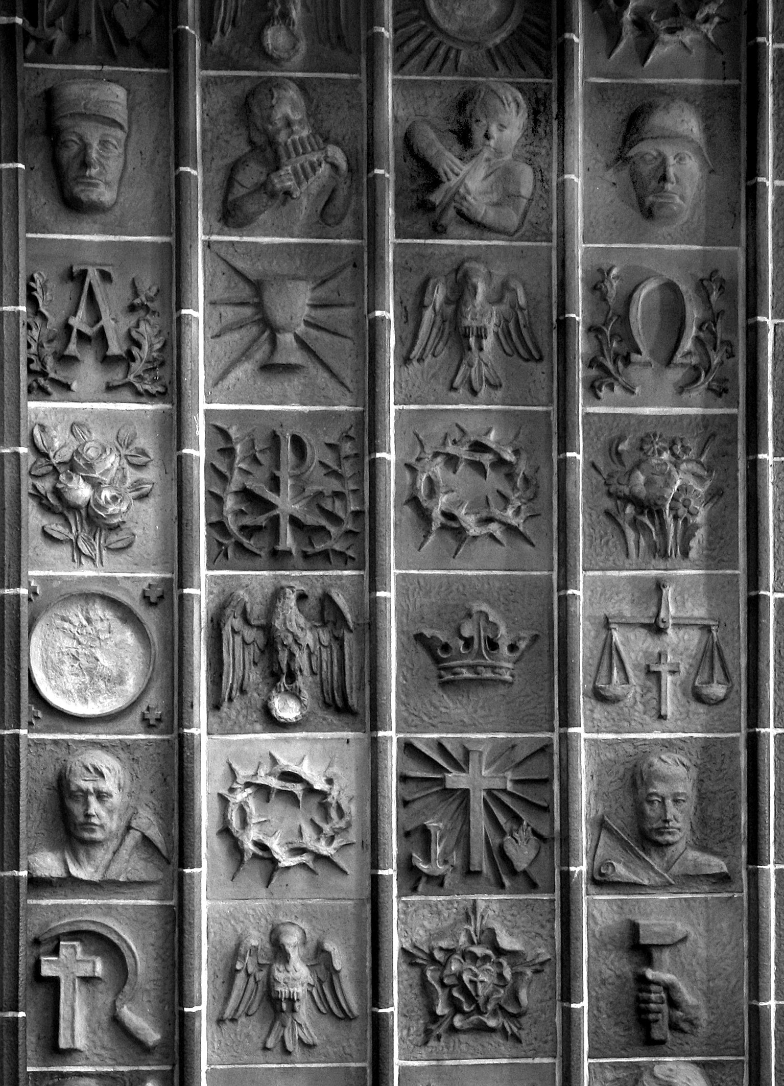
Of course you may find many interesting forms of preoccupation with Nazi symbols in the field of the arts, especially in visual arts since the 1980es. A famous one is, for example, the provocative painting “Ich kann beim besten Willen kein Hakenkreuz erkennen” (“With the Best Will in the World I Can’t See a Swastika”) by Martin Kippenberger from 1984, which, unlike the title says, motivates the observer to search for the swastica in the very upsetting tableau and to reflect about the tabooing of the time of National Socialism in Germany’s post war society. In public space, however, motives and works like these are hardly ever found. And still valid is the law “§ 86a” which says that anticonstitutional attributes and emblems may not be presented in public; this includes parols like “Heil Hitler” and Nazi-songs, but not uses with critical intent or those for art and science.
The portrait of Hitler, though, is severely present in public space when you look at front pages of magazines and comics, at film posters or satirical event announcements which are posted at kiosks and advertising columns. Since the mid-sixties, especially in the 1990s, Hitler appeared on the title-page of the news magazine “Der Spiegel” more often than any other person. Yes, Hitler sells! It is easily forgotten that all those Hitler portrait photos are a product of strictly controlled Nazi propaganda, motives that were presented in the Nazi years showing him as he wanted to be seen: as a succesful party leader, statesman, field commander, demagogic speaker, leader in touch with the people, with subtle awsome or even demoniac shaping, mostly taken by the “photographer of the Führer” Heinrich Hoffmann.

Those cover pictures have definitely contributed to reproducing the Hitler myth in the post war era and transfering it into the present and future. Only since the midnineties the depiction of Hitler has become more ironical, due to parodistic movies, comedies, comics, and later to the World Wide Web, its networks and its YouTube distribution. In the 1980es and 1990es you could get the impression that Germany was seized by a kind of Hitler mania, meant with critical subtitle (of course?).
However, things become more complicated when we ask about the uses of Nazi symbols to make exhibitions in an enlightening sense. The first significant exhibition on “Hitler and the Germans” was presented by the German Historical Museum Berlin in 2010. The subtitle “Volksgemeinschaft and Verbrechen” (people’s community and crime) underlined the critical approach. The posters for this exhibition which were presented in the public space confined themselves to a sober, purely scriptural design. The exhibition team discussed this thoroughly, but rejected the idea of a Hitler picture in subways and all over the city. The title of the catalogue, on the other hand – showing a picture of Hitler at one of his earliest mass declarations, the May 1st rally at Berlin Tempelhof Airfield 1933 – added the aforementioned subtitle to the black and white photo with a vibrant, eye catching red bar. Black, White and Red were the colours of the Nazi banner (which is said to have been designed by Hitler himself), reproduced in countless items. The public space in Germany was black, white and red, when it came to Nazi manifestations.
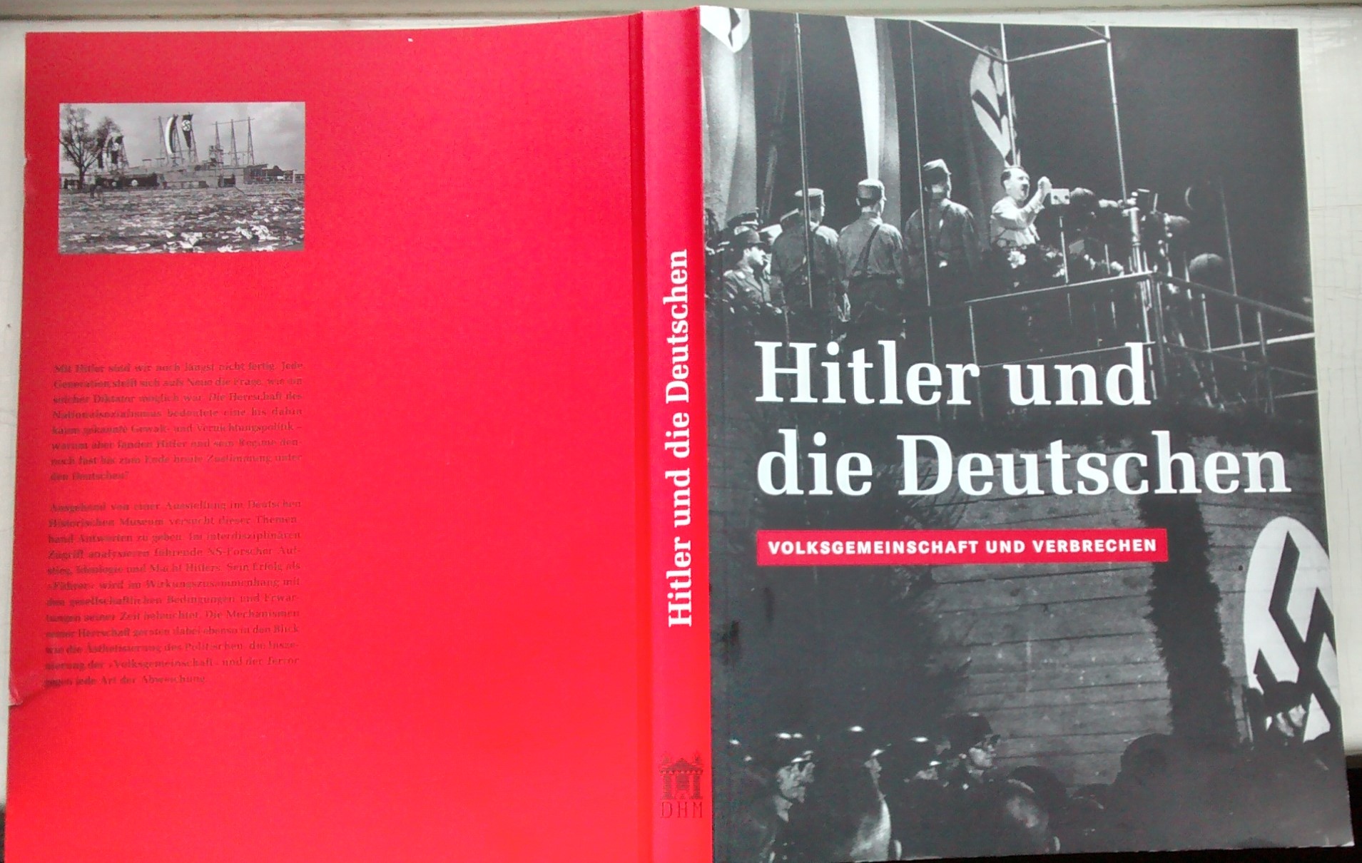
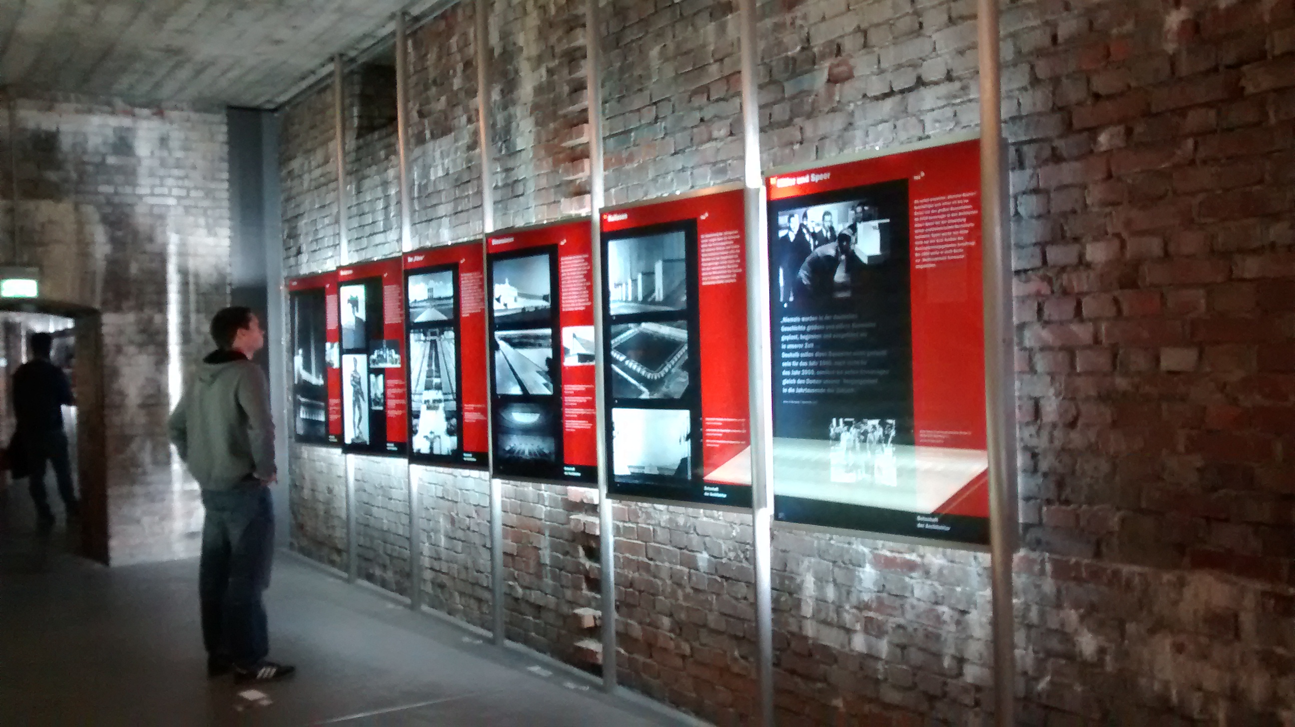
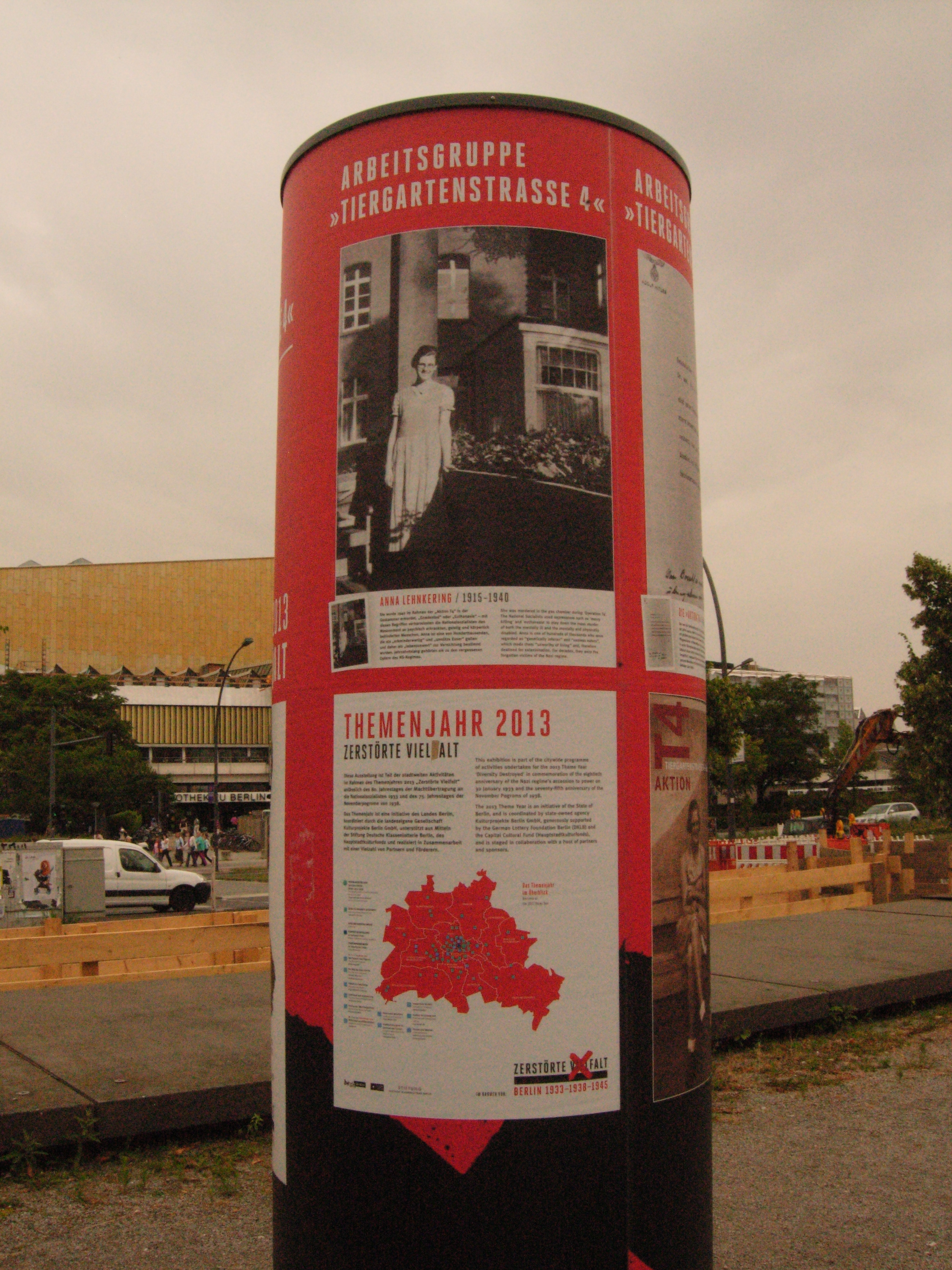
This calls attention to a more subtle use of Nazi symbols, widening the scope of the term “symbol”. Some documentary exhibitions play with the fascination which comes from the connotations that we connect to this colour combination – perhaps even unconsciously. One controversially discussed example is the main exhibition in the Documentation Centre Nazi Party Rally Grounds in Nuremberg. It opened in 2001 in the so-called Congress Hall, designed by the National Socialists to house 50,000 spectators. While the modern architecture for the documentation center tries to “break” the megalomanic Nazi architecture, the exbibition “Fascination and Terror” applies a design which strongly relies on the above-mentioned colours Black, White and Red, and on dramatic light effects which bring to mind the light installations by Hitler’s architect Albert Speer, also in action on the Nuremberg Nazi Party Rally Grounds at that time. Another example, completing this little reflection, is the project “Diversity Destroyed – Berlin 1933-1938-1945” in 2013, which brought together many museums and initiatives dealing with the history of Berlin during the Nazi time. All over the city you could see advertising pillars and bulletin boards advertising the decentralised projects and exhibitions in Black, White and Red. This attracted much public attention, but also caused protests from some of the participating groups who rejected the idea of placing their project under the speculative ideas of some external designers.
